Putting motion at the core of a new skiwear brand movement.
Identity ✦ Direction ✦ Product ✦ Motion

Client: Van Loon Sport
Agency: MultiVitamin
Role: Art Director
▉ Brief
Build a brand identity about casting off restrictions of the sport's traditional past to offer something new and exciting.
▉ Creative Process
Inspired by dynamic ski trick silhouettes and boldly redacting outdated principles, motion became a core tenet of sharing the brand values in an authentic way.
3D printing the logo's "redaction bars" we collaborated with the founder to physically arrange them into a variety of skiing trick poses for the brand marque. These were then market tested to help select the most memorable silhouette.
I continued to devlop brand and product content, creating a strong client partnership as well as brand image. Workshops opened up additional creative opportunities for the project's scope, such as animated product photography.
▉ Result
Featured in GQ magazing, VLS earnt recognition for bringing revitalised energy into the sport. The rebrand earned special kudos awards on CSSDA, nominations on Awwwards, and more.
Reflecting it's values, the marque is based on bold, dynamic redactions arranged in a ski trick silhouette.
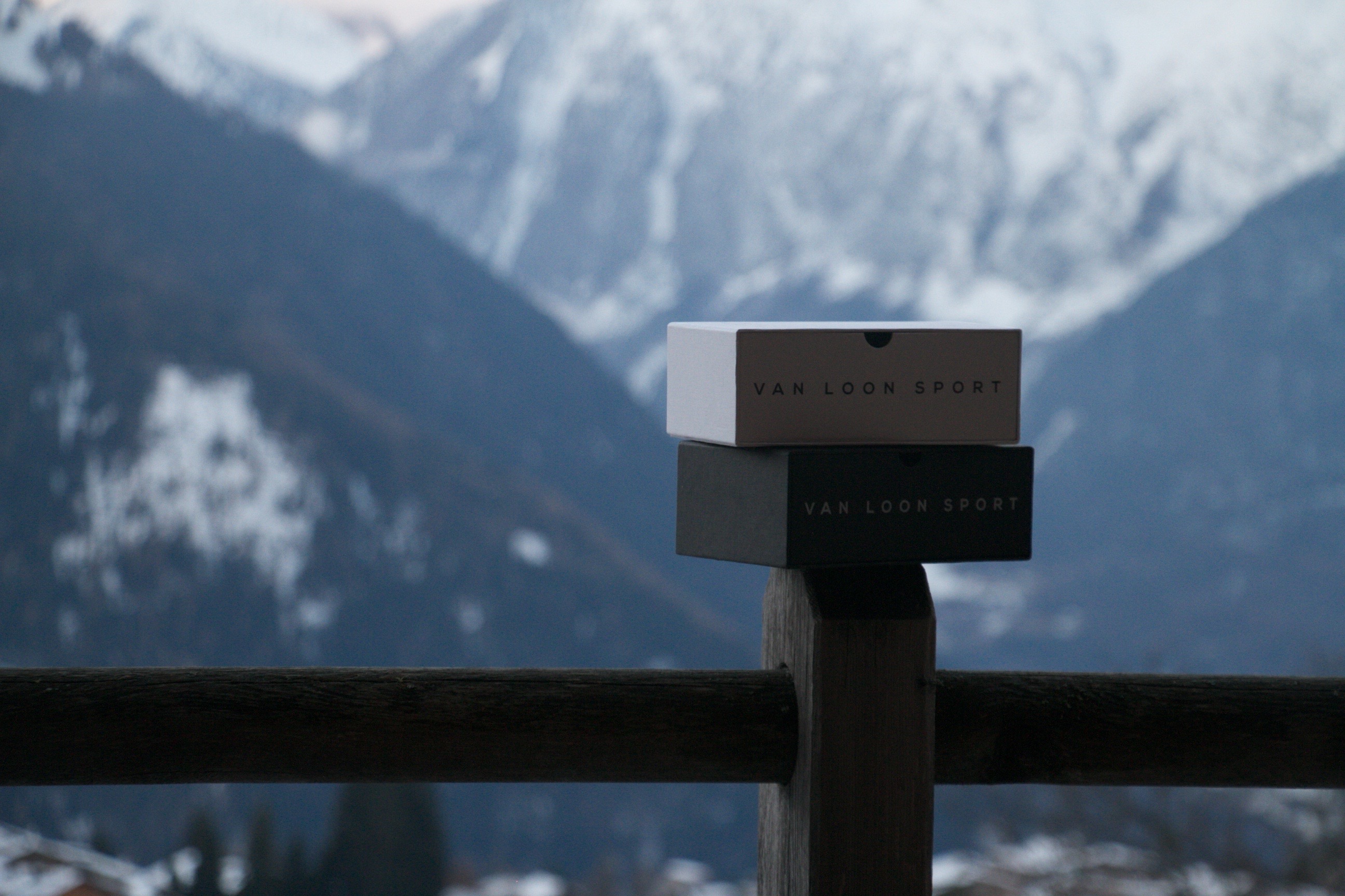
Directed with minimalism, every asset took the opportunity to catch your eye on Van Loon's quality, lifestyle, or our visceral desire to be active.
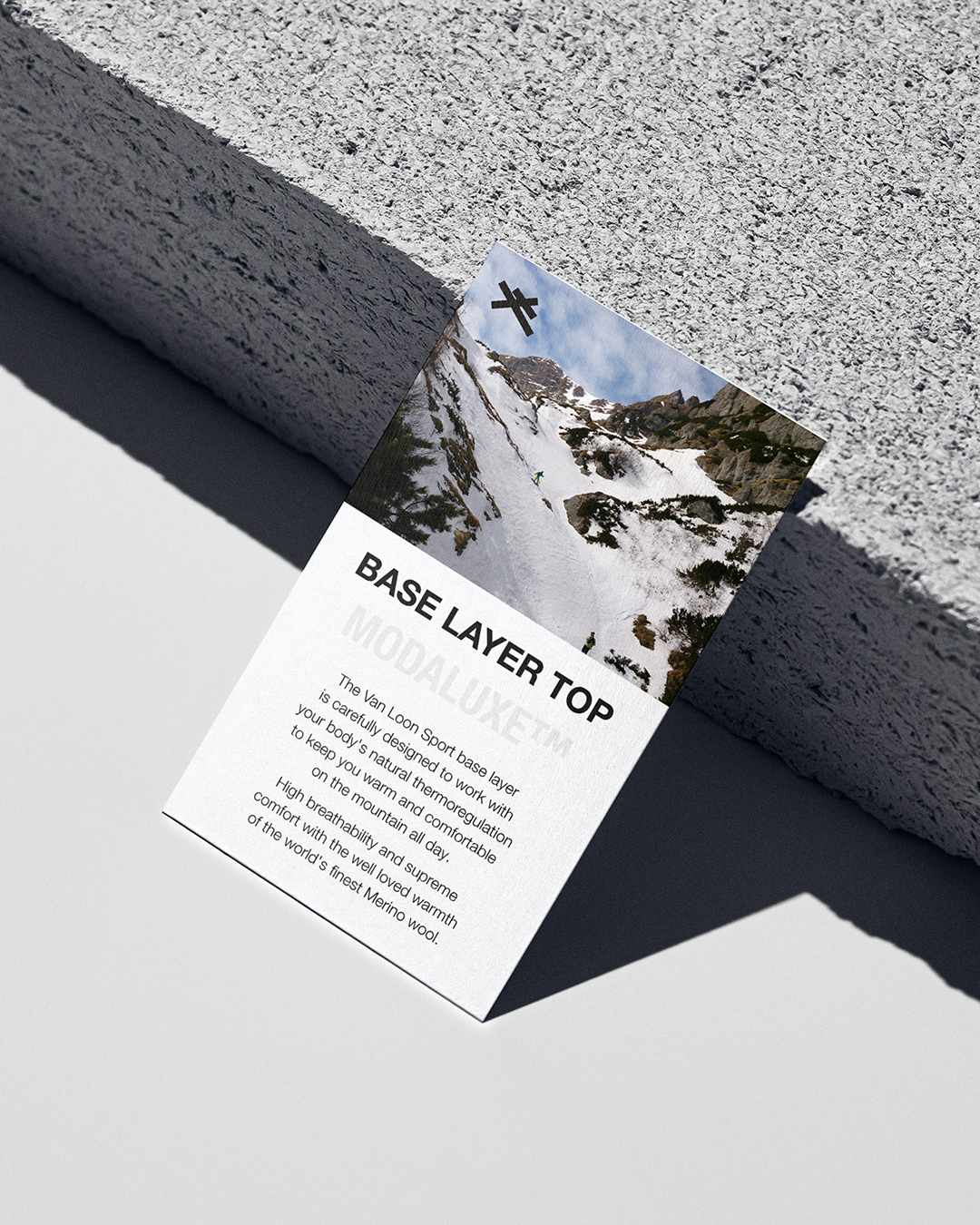
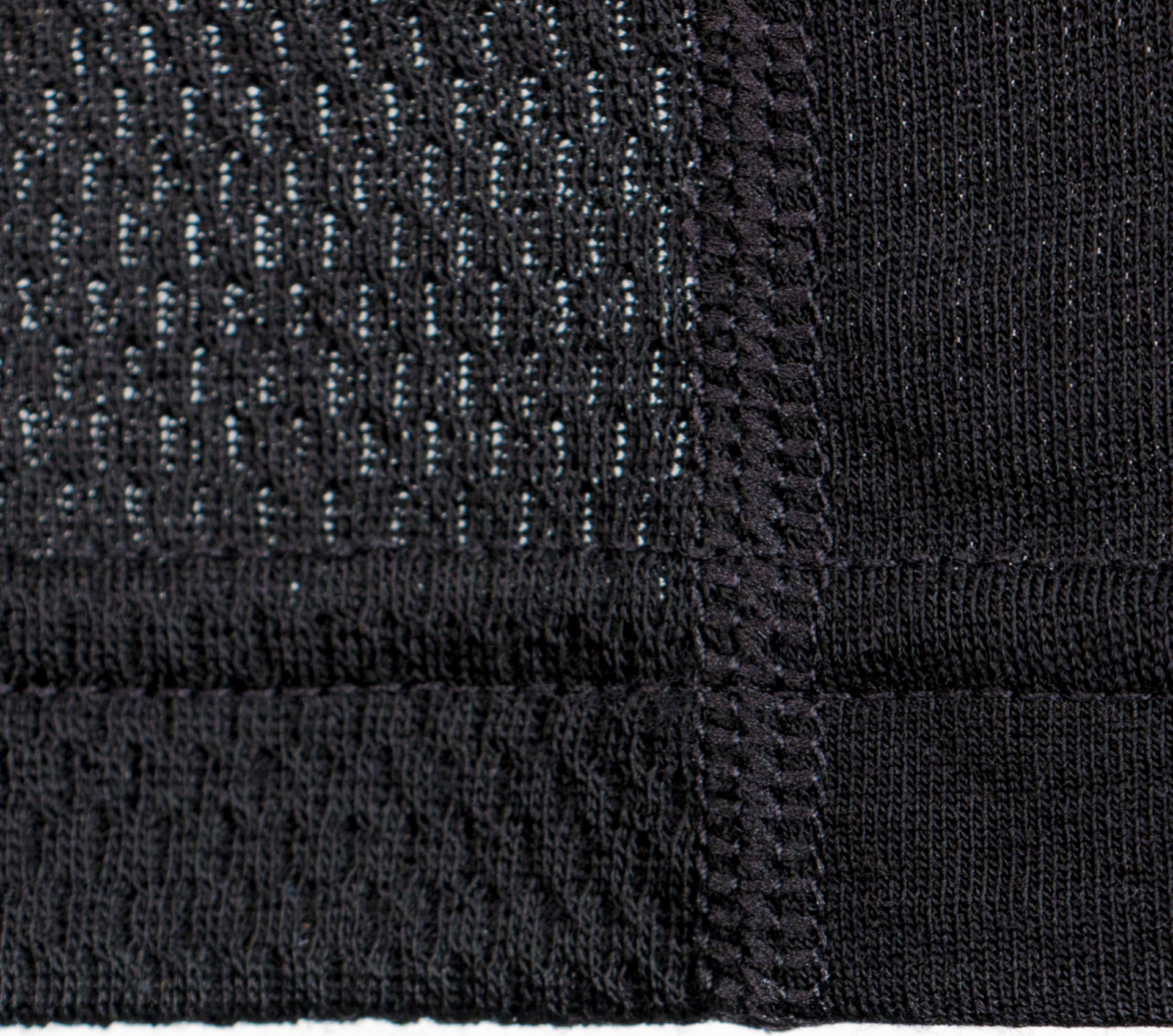
Van Loon's unique performance fabric, Modaluxe, became a valuable proof point in the brand mission of bucking heritage to create the future.
Put simply,
I want to do great work, for and with, great people.
✦ You can find me at